Wednesday, October 28, 2015

Week 10B

Today in class we started talking about CSS (Cascading Style Sheets) and how to use them to style our web page. There are three different ways of using CSS:

  1. Inline, this is where you put the style you want within the tabs of your html page
  2. Embedded, this is when you put all the styling within the head tag so it covers the whole page
  3. External, this is the most commonly used. It is when you create a separate CSS document and write the coding for each part you want to style and connected it to your html page through a link in the html coding.

Link in html when using External CSS coding:


There are different parts of the CSS Syntax; there is there selector, the declarations, the property, and the value.

Within CSS coding there are three different ways to style what is in your html.

There is simply typing the tab name and styling it:


(view of webpage)

There is using classes. Classes are not very unique,  the same class can be used on multiple elements and multiple classes can be used on the same element.


(this is how you insert it into your html)

And then there are IDs, which are very unique. Each element can only have one ID and each page can only have one element with that ID.

(this is how you insert it into your html, don't forget to close! </div>)

Before creating an external CSS document to create all the styling, using inline CSS this is what the homework from last class looked like:


We used this in order to style our made up resumes that were homework from last class. All the styling you see here is done through a separate CSS file:


This is what the whole CSS document looks like as of now:


Monday, October 26, 2015

Week 10A

Today in class we started talking about the Internet/WWW, and HTML. We started off talking about what the Internet is and then  went over a few terms such as HTML (HyperText Markup Language), FTP (File Transfer Program), and WYSIWYG (What You See Is What You Get). After that we watched a few videos on "Don't Fear the Internet," that went over how to use HTML to create a webpage.

Once we were done with the videos Professor Pannafino gave us a HTML Tutorial that we had to work on. Here is what we did:

At first the tutorial just had us type into our text editor (I am using Sublime text 2) "This is my first web page," save it as an html file and open it in our browser. All that came up was our text "This is my first webpage," on an all white background. Then we stated getting into more detail.

Next I had to put in tags. When I refreshed the page, it looked the same but that is to be expected.

I then created a title which put text into the tab on my browser.


I then had to break up the text so it was not all on one, single line.


I then worked with then emphasis and strong tag which added detail to the text.


Notice: "is" is italicized because of the <em> tag and "Warning:" is bold because of the <strong> tag.


Next was creating headers using the different header tags. Then are 6 different headers, h1 being the biggest and h6 being the smallest.


After that I worked on creating lists using the <ul> tag which creates a bullet point list.


After that I used the <ol> tag to create a numbered list.


I then had to create a list within a list.


I then had to create a link to a webpage, I decided to just us Google.


Once I clicked on the link above, it took me right to the home page of Google.


Thursday, October 22, 2015

Week 9B

October 21st

During class today we had our final critique for our 404 Error page. When it was my turn to go, I went up and presented my page to the class. I explained the website I created it for and why I created my page the way I did. My classmates suggested the following:


  • Match the backgrounds so they blend together
    • I managed to fix this after presenting and will make sure it gets back into the right folder.
  • Change the font of the text on my page so it better matches that of the website's main page.
  • Possibly switch out the Polaroid camera for a more modern one
  • Maybe use a different photograph for the error page, possibly one of a family and use Photoshop to make it look a bit aged to go along with the vintage-like feel of the website.


I do plan on going back into Photoshop with my error page and using the suggestions my peers gave me to create a more successful 404 Error Page.

Wednesday, October 14, 2015

Week 8B

Today in class we started out having a mini critique for our 404 Error Page within our rows. Some of the suggestions I had was to change the font of my one piece of text and play around with the photograph I have in my page. I mainly worked on little details such as straightening items and finding the correct font for my error page.

I still have a little bit of fixing up to do and make sure it works out in the html page but I believe I am just about done.

Monday, October 12, 2015

Week 8A

Today in class we went over a few more aspects of Photoshop and then had the rest of the time to work on our 404 Error Page.

In the beginning of class, this is what my error page looked like:


As you can see, not a lot has been done, just a scanned image and a photo I traced have been placed into a Photoshop document.

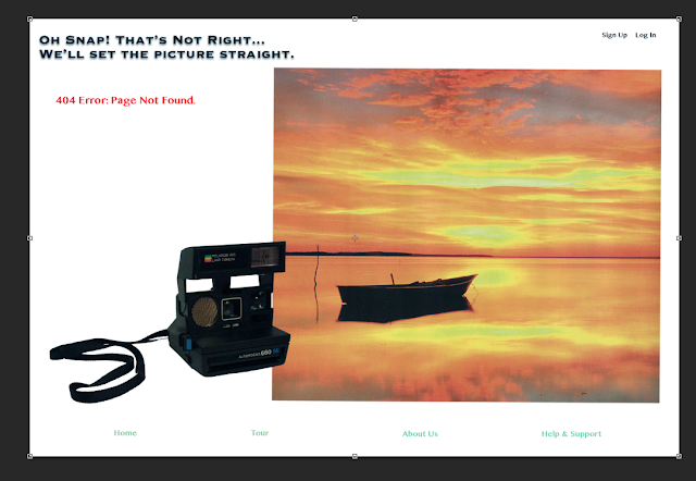
Today I added text, a few accents, and worked with the layout some more. I added the text in Photoshop. I chose the text I did because it went along with options from the website I am creating this page for.


I decided to bring up the website www.pixieset.com again, which is the site I am making the error page for, so I could choose the right text font and color scheme. This is what the site's home page looks like:


I decided to choose a font that look similar to the text "Beautiful Client Photo Galleries," and use the light teal color (like the "Get Started" box) throughout my 404 error page to connect the two pages.

I then went to Illustrator to create a rectangular shape the text at the bottom of the screen would sit in.


I then went back into Photoshop, went to File -> Place Linked and added the teal rectangle into my Photoshop document. I placed it around the "Home" text at them bottom of the screen and then, holding down the "option" key, created three more to surround each individual text, editing their size as needed.


After looking over my page, I decided to make all the rectangles the same size. I deleted the ones around "Home," "Tour," and "About Us," and while holding down the option key, using the box around "Help & Support" created copies of that same size box and placed them around the rest of the text.


Once I was done with this, I went back into Illustrator to create another accent shape for my page. I decided to create a single line:


Placing it into Photoshop the same way I brought in the rectangle, I placed the line right above the top edge of the photograph, as seen here:


I also switched the position of the "404 Error: Page Not Found." and "On Snap! That's Not Right..., We'll Set The Picture Straight," text which I believe works much better that the placement before.

I may add in the name of the website somewhere within the error page and possibly switch out the photograph with a different one but as of now I believe I am just about done. 


Week 7: Outside the Classroom

For work outside the classroom we had to watch a number of videos on how to use Photoshop. Photoshop Workspace was an introduction to Photoshop and skimming over the different tools. https://helpx.adobe.com/photoshop/how-to/introduction-work-area.html?set=photoshop--fundamentals--photoshop-workspace )

Panning and zooming was (obviously) a tutorial on how to zoom in and out of your image and how to pan across it. https://www.youtube.com/watch?v=Vvbd_p2d4AU&list=PLfK2tDJdBamSXK_i3zjexwcsHxX7w_ax3&index=14

Cycling Through Different Screen Modes went over the different views of the screen you could choose from and the shortcuts for how to get them. It also went over how to change items like the dropshadow in Photoshop. https://www.youtube.com/watch?v=Sy5V4ifoMyo&list=PLfK2tDJdBamSXK_i3zjexwcsHxX7w_ax3&index=15

Understanding File Formats talked about the different files you can save your image as. One way is JPEG which is a single layer that is compressed and a smaller size, this is what you see most often on the internet. Another file is RAW, which is an image captured by a digital camera. There is another type of file called DNG which is open to anyone through Adobe and is an archival format for RAW images. Two others are PSD and TIFF, neither of these lower the quality of an image. https://www.youtube.com/watch?v=nXRKgo0CAu0&list=PLfK2tDJdBamSXK_i3zjexwcsHxX7w_ax3&index=16

What Resolution Image Will You Need goes over the different resolutions of an image. There is Halftone which uses a CMYK dot pattern and is used by printing press. There is Continuous Tone, most commonly used by Inkjet printers.The third is the resolution for the screen of monitors, tablets, and/or projectors. https://www.youtube.com/watch?v=uP0K_JJqrA&list=PLfK2tDJdBamSXK_i3zjexwcsHxX7w_ax3&index=19

Crop and Transform a Photo - Crop a Photo simply goes over how to use the crop tool in Photoshop. This allows you to create a whole new composition. It is recommended to not have the "Delete Cropped Pixels" selected when cropping your image. https://helpx.adobe.com/photoshop/how-to/crop-remove-photo-edges.html?set=photoshop--fundamentals--crop-transform

Crop and Transform - Resize an Image is short step-by-step tutorial on how to resize your image in three quick steps. https://helpx.adobe.com/photoshop/how-to/resize-image.html?set=photoshop--fundamentals--crop-transform

Crop and Transform - Understanding Canvas Size shows you how to change the width and height of your canvas. https://helpx.adobe.com/photoshop/how-to/photoshop-understand-canvas-size.html?set=photoshop--fundamentals--crop-transform

Introduction to Layers talks about how to use different layers to add interest to your image and be able to go back to that single aspect without risking changing the entire image.
Mask Out Part of an Image goes over how to use the layer mask to hide pixels instead of completely erasing them. https://helpx.adobe.com/photoshop/how-to/layer-basics-explained.html?set=photoshop--fundamentals--layers

What are Photoshop Adjustment Layers teaches you how to use adjustment layers to enhance your image. Any adjustments made under "Image" -> "Adjustments" is permanent which is why it is most recommended to use the adjustment layers (under "Window") menu. https://helpx.adobe.com/photoshop/how-to/mask-select-photo.html?set=photoshop--fundamentals--select-image-part

Under Image Adjustments, the two videos I decided to watch were Lighten and Darken Areas and Change Color and Saturation. https://helpx.adobe.com/photoshop/how-to/photoshop-adjustment-layers.html?set=photoshop--fundamentals--image-adjust

Lighten and Darken areas goes over how to select different parts of your image to lighten and darken. This involves masks. https://helpx.adobe.com/photoshop/how-to/photoshop-dodge-burn.html )

Change Color and Saturation talks about how to use the Hue/Saturation adjustment layer to change specific colors in your image.https://helpx.adobe.com/photoshop/how-to/photoshop-shift-color-hue-saturation.html )


Wednesday, October 7, 2015

Week 7B

Today in class we started out by going over how to use the clone-stamp tool and adjustment layers to aid in the making of our 404 Error Page.

After that we had the rest of class to start working on our 404 Error Page using the images we took ourselves and scanned from magazines, books, etc.

Today I just worked on tracing the images I want to use for my page. This included a Polaroid Camera and two images I had scanned from a book.

First I started with tracing the camera and placing it into an empty Photoshop document:


After that I traced one of the two images I am thinking of using for my page:


I then added that image to the Photoshop document that now contains the image of my camera and played around with its position:


I also traced a second image I am contemplating using in my 404 Error page:


I copied that image into the Photoshop document as well and then made the layer holding the three photographs invisible so I could play around with the new one to see which I preferred.

As of now I know for sure I am going to use the image of my Polaroid Camera but am not 100% sure which scanned image I am going to use. I still have a few more options I am going to play around with.


Monday, October 5, 2015

Week 7A

Today in class we started talking about the new project we are working on. Our new project is creating a 404 Error Page for a specific website of our choosing using Photoshop and Illustrator. Our final product must include one scanned photo, one captured photo that we took ourselves, and one graphic created in Illustrator. Our error page must also reflect the brand, capture user attention, explain what the problem is and how it occurred, instruct the user how to correct it, is written in plain language using an active voice, and show a supporting composite visual.

After going over the project, I started searching for websites that did not have creative, thought-out 404 error pages. I found three that I could work with are Forever 21, Amazon, and Verizon Wireless. These are their error pages:

Forever 21:

Amazon:

Verizon Wireless:


After narrowing down my search to these three websites, I started sketching out and writing down some ideas. Forever 21 and Verizon Wireless were not too hard to come up with ideas but Amazon, because it is such a broad company, was a lot harder.

Here are the sketches I have so far for each company:

Forever 21:


Verizon Wireless:


Amazon:


So far my stronger ideas are Forever 21 and Verizon Wireless. I still would like to come up with a few more sketches for each.


The hardest past is going to be getting images for this project.


Saturday, October 3, 2015

Week 6: Outside the Classroom

Today was the Interdisciplinary  Interaction Design Conference. There were four speakers, Joni Trythall, Kasey Hults, Erin Good, Sam Provenza, and Sofia Millares. They each talked about something a bit different. Joni talked about Scalable Vector Graphics (SVGs) and how to use them. Her presentation included work of her own as examples which helped with understanding how exactly it works. Kasey Hults talked about her experience in the workforce, who she worked for and the process she went through when creating designs for companies. Erin Good talked about her experience with interviews for internships and job opportunities and gave out advice for us college students who will soon be going through the same process. Sam Provenza's presentation was about Flexbox and how to use that when designing items like websites, she even showed up an example she had set up and went through it to show us how it works, letting us see the changes made not only in the coding but the appearance of her design as well. Finally, Sofia came up to give her presentation. Like Kasey she talked about her work with Nasdaq and how her team works together to come up with different designs for clients.

Thursday, October 1, 2015

Week 6B

In class today we learned how to take part of one image and photoshop it into another, making it look like it is actually part of the second picture.

In order to do this, you must have both images open in Photoshop. You then go to the image you want to take a part of, and using the pen tool, outline the section of the image you want to take out and place in the second image. Make sure when outlining, you zoom in pretty close and take your time outlining the image. After outlining what you want to edit, go to the Path panel and chose Make a Selection from the drop-down menu, you then change the feathering to .2.n Once this is done, just click Command-C to come, go to the second image, and click Command-V to paste. You'll then scale the copied image to the correct proportions (remember, when you are scaling down, you lose those pixels so take your time). When placing your copied image behind whatever is in your second picture, outline using the pen tool again the parts that will be covering your copied image. You'll then do the same thing you did after outlining the section of the first image you wanted to copy into the second. This is how you photocopy one image into another.

After practicing this on our own in class, we started the actual in-class/homework assignment. For this assignment we needed to scan an ad from a magazine and open it in Photoshop, then take a picture of ourselves that we will then edit into the image of the ad.

This is the ad that I edited myself into:


And this is the photo of myself that I edited into the ad:


After following the same steps from above, this is what the finished product looks like:


I had to fix up the lighting on the image of myself once I edited it into the ad as well. Tracing myself was a bit difficult and took some time but once that is done, the rest is pretty easy.