Monday, November 30, 2015

Week 15A

Today in class I worked on creating a new title for my webpage. I studied Jessica Hische's Typography work and created a title inspired by what I saw.

This were some of the images I was looking at to come up with my own title:


Here are a few of the ideas I came up with:


I decided to go with this design:


I felt this design would be good for the title of my webpage because it represents her style it is not too complicated and is easy to read.

I then uploaded the above image into Adobe Illustrator and proceeded to trace it.

This is what I have so far:


(with image in background)


 (tracing)

Tuesday, November 24, 2015

Week 14: Outside the Classroom, Timothy Goodman: Getting Away With Shit

Monday, November 23rd I went to see Timothy Goodman speak at the Pennsylvania College of Art and Design. The title of his presentation was Getting Away With Shit. Timothy Goodman talked about his life as a designer starting from when he was a kid to present day. At first, Goodman went to community college and worked as a house painter but always dreamed of going to school in New York City. He finally got the chance and went to school the School of Visual Arts in New York City. A few years after graduating, he got a job at Apple and moved to California, but not for long. Soon he was back in New York City and working for himself as an illustrator/designer. His latest projects have been "40 Days of Dating" with his close friend Jessica Walsh. They decided to do this together because Jessica, how is a hopeless romantic and jumps into relationships too quickly, and Timothy, he is a commitment phobe, both wanted to know what they were doing wrong in relationships. They chose 40 days because of it is a very biblical number and it just seemed like the right amount of time to really get to know someone but not be annoyed by them. After the finished the 40 days, they put all their findings together and published a book, not long after that Hollywood producers were contacting them asking to make this concept into a television show or a movie. As of now Warner Bros. owns the rights and may just be working on a movie. Another project Timothy is working on is "instatherapy." Timothy writes his own quotes and posts them on Instagram, he says this is a type of therapy to him; he writes down his thoughts and feelings and then just puts them out for the world to see. Timothy has another project he uses Instagram for and that is "memoriesofagirlineverknew." Goodman takes sections of paragraphs he wrote after a relationship he had with a girl he really liked failed and posts them on Instagram.

Of course, he explained how he gets away with shit as a designer. In order to do so one must know the rules, have some audacity, never ask permission (only forgiveness...sometimes), listen to yourself, get in your work, and always stay/be young. One project Timothy Goodman was a part of years ago was helping design the CNN Grill where he created a neon light sign that looked like a penis but no one seemed to notice.

During the Q&A portion, one girl asked him what advise he has for designer block. His response was perfect, he said "why keep running yourself into a brick wall? Just go another way."

Timothy Goodman's presentation was great and I absolutely love his work. I am glad I got to go to this presentation.

Monday, November 23, 2015

Week 14A

Today in class we started out with a lecture/demonstration from Pannafino showing us how to create columns and add content to them for out web page. Most of it was review for me but I made sure to jot down the notes just in case. After that the rest of class was work time.

Since I am so far along with my web page, Pannafino came over to critique it and give me some suggestions on how to possibly improve it. He told me to maybe create a new title by drawing something out and then going into Adobe Illustrator and Adobe Photoshop to trace it and create it digitally for my web page. He also suggested breaking up the bio section of my page into two columns instead of just the one. I also need to fix up my spacing throughout the page and edit my text a bit.

I drew out a few ideas for a new title but I am still working on it, here is what I have so far:


I still need to come up with more refined ideas and sketch them out in my sketchbook so I do not have the distracting lines when I go to trace which ever title design I choose.

I also added a little bit more spacing between my images and edited the font size of my text.

Before: 


After:

Another thing I changed was the bio section of my web page, I broke it up into two columns like Pannafino suggested:


I added another box underneath the two columns to place the link to her own website in, that way the columns are just about equal in size.

Wednesday, November 18, 2015

Week 13B

Today in class we started off by taking a few notes. Pannafino showed us how to create a hover effect with an image and how to make images links. He also showed us how to add different effects to links. After that the rest of the class was just work time for our final web design.

For my final web design I changed a few of the images on my page to try and show the range of work Jessica Hische does. I also change the image I had of "Title Case" under side projects so it was not blurred like the previous one. This is what my web page looks like as of now (3:43pm):


and here is all the coding so far (3:43):


During class I also added two links. One to her Drop Cap website and another to her official website. I put the link to her Drop Cap site in the Drop Cap section and her official web-address at the end of her bio.

I ended up changing the background to a floral pattern because I believe it is more of Jessica's style than the simpler kind of boxy pattern I had before.
Here is the new background:


I played around with a few things and came across how to round off corners so I decided to try it with my page. As you can see in the image below I rounded the corners of the picture of Jessica, the title, and, although it is very hard to see and also not pictured here, the corners of the main area everything is located in as well as the footer.


Today I just made some small changes to my webpage, nothing too complicated. In the footer of my webpage I am thinking about writing my own opinion on Hische's work but I am not 100% sure if I will do that or not. At the end of class today (5:30pm) this is how my webpage looks:


I do not think I have much work left to put into it but I am going to keep looking through w3schools to see if there is anything I could add to my page.


Tuesday, November 17, 2015

Week 13: Outside the Classroom

November 16

The more we learn about CSS and HTML coding, the more excited I get about the final project for this class and projects of my own that I have started. After class today I stayed late so I could finish the last few rows of images on my webpage. I continued working on my webpage later in the evening, adding a hover tag to my images, images as links, and I even added a Google font.

Here is the photo of the effect I added to the images:


Here is the section I added of her side projects, the images are links to each website shown in the images:


November 17th

Today I added descriptions to the Side Projects section of my webpage as seen here:


I also added titles to the rest of the sections, it did not look right to me that only the "Side Projects" section had a title while the others did not.


I also added a background color to the main area of my webpage (where all the information is) that is very similar to the colors in the background pattern of the whole webpage. It is not very noticeable but it helps make it easier to read the text on the page.

November 18th (before class)

Today before class I added another section to my webpage. Jessica Hische does a lot of drop cap designs and although they are considered a side project for her, she has so many that I decided to give them their own section. Here is what it looks like:


Like the rest of the images, these three have the same effect.


Monday, November 16, 2015

Week 13A

Today in Digital Theory we first broke up into teams to have a little competition to see what team of three could create an image change using html and css. Sadly, my team did not win.
After that we took some notes and Pannafino explained the different types of fonts, Google fonts and how to use them, and subtlepatterns.com where he showed us how to download and use those images as backgrounds for our webpage. The rest of class was just time to work.

During class I added a background from subtlepatterns.com:

This is the pattern I downloaded to use


The coding:

The result:


After that I took the piece I created in Illustrator (which I did change a bit), saved it as a PNG file, and set it as the background of the title for my page:

The changed piece:


The coding:


The result:


Once I was done with that I added an image of Hische into the small tan box you see above:

The coding:

The original image I saved was much bigger than the space I placed it into, in order to get it to fit I had to alter its size using the background-size tag in my css.

The result:


Once I finished that, I removed the background color from the large tan box you see above and added a bio of Hische. I have not edited the font of the text within that area just yet but I do plan on going back into it.

Coding and result:


After I finished typing in most of her Bio, I started working on adding her artwork into each section. I added some examples of her book covers and illustrations into the designated areas.

Here is what my webpage looks like thus far:

Coding and result:


The plan is to get all the images into each area and then I will go back and add the text. For the last section (which you cannot see here) I will also be adding some links.


Week 12: Outside the Classroom

Over the weekend I finished creating the layout for my final webpage. Just like Jessica Hische's page, it is very organized and simple. While I wanted to do something fun and creative I also wanted to make sure the page looked true to how Hische would want it.

Here is the coding:

HTML page:

CSS page:


Here is what the webpage looks like:


I also created a title in Illustrator using two image of Hische's work and used a font I believe she would like for her name.

Here it is:


Wednesday, November 11, 2015

Week 12B

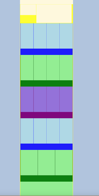
Today in class we first showed Pannafino our homework, the mapping of different websites' designs. He also had us talk briefly about what we observed while doing this. One thing I noticed was how most websites I looked at started out simple, had a good build up to the middle of the page, and then went back to being simple at the bottom.

After that Pannafino went over how to create floating boxes and columns for our webpage. He showed us how to create the basic layout of a webpage as well.


Once we finished that, the rest of the class was work time. Pannafino had us sketch out an idea or two for our webpage layout and then figure out how that would be created in a CSS document.
This is what I have so far (very very very rough sketch):


My webpage layout is very simple, structured, and organized. I noticed this is how Jessica has her personal page set up as well (not the same layout, but simple, structured, and organized), so I would like to keep it like that and not do anything too fancy.

After I sketched my idea out on paper, I created an HTML and CSS document and designed my layout there just so I could see how it looks. So far this is what I have: